
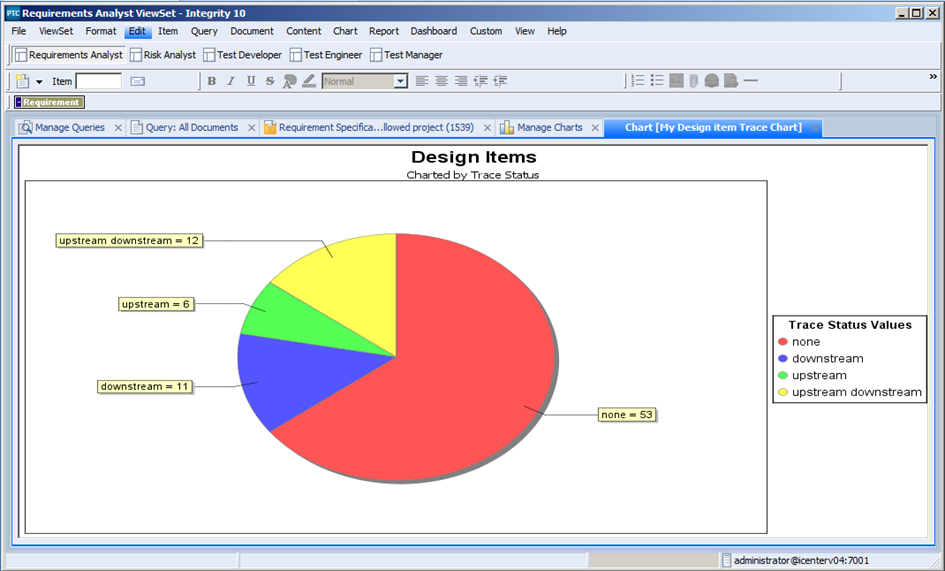
In my previous articles, I discussed how we can calculate trace report metrics, and then gather them into a report. In this report, I am going to discuss how we can gather similar metrics and put them into a chart format. This time though we are going to use a field called Trace Status and chart what items have upstream, downstream as well as items that have horizontal traces. The particular chart we are going to build is going to retrieve all the Design content items in the database, and then chart them based on the selected Trace Status Value. The chart we are going to build will look as follows:
Like the report in the previous article, the chart will perform the following activities:
- It performs a query on the database to retrieve all of the Design items currently in the system.
- It then groups those results by the selected Trace Status values
- Then it presents the results as a pie chart.
Next I will take you step by step through the process of building this chart. Perform the following steps to build this chart:
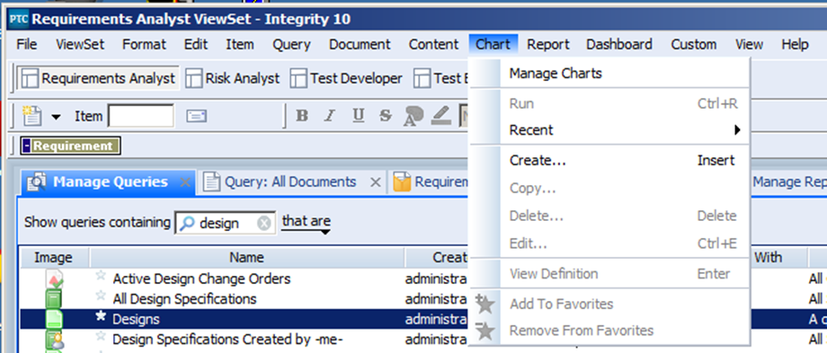
- From the main menu bar on your Integrity Client select Chart -> Create… to create a new Chart on your system. If the “Chart” menu or the “Create…” does not exist, you may have to customize your ViewSet to make it visible. The “Create Admin…” option should only be used if you are a member of the Administrator group and you are looking to build a system based chart that will be used across the entire Integrity instance. In this case I just want to build the Chart for myself and maybe my teammates.
- This will open the Create Chart dialog from which you can create your new Chart.
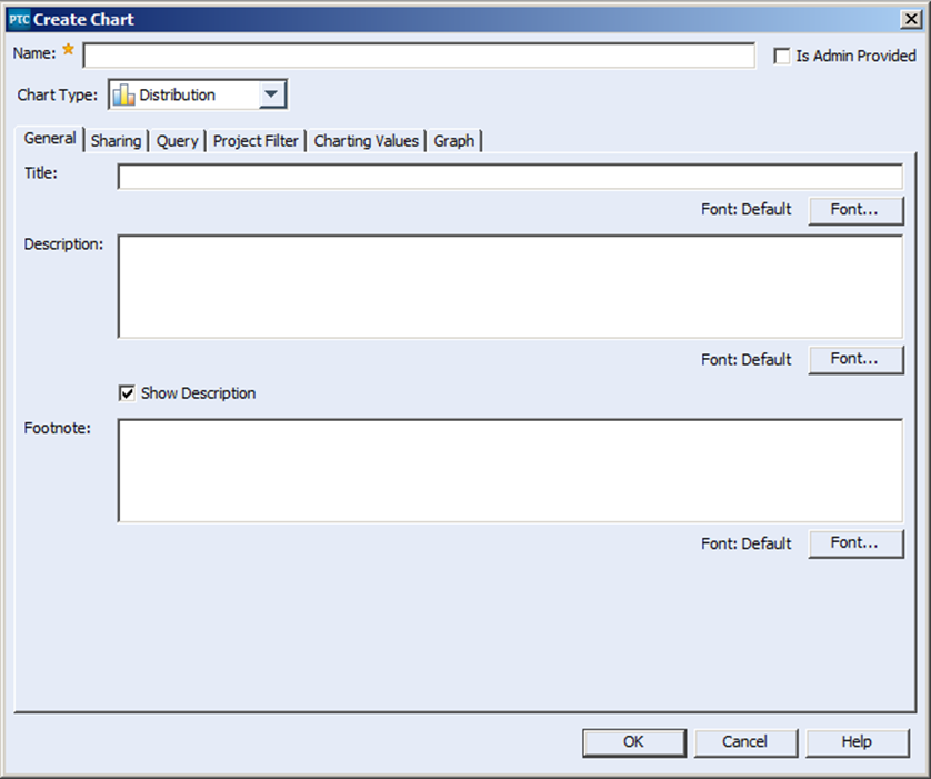
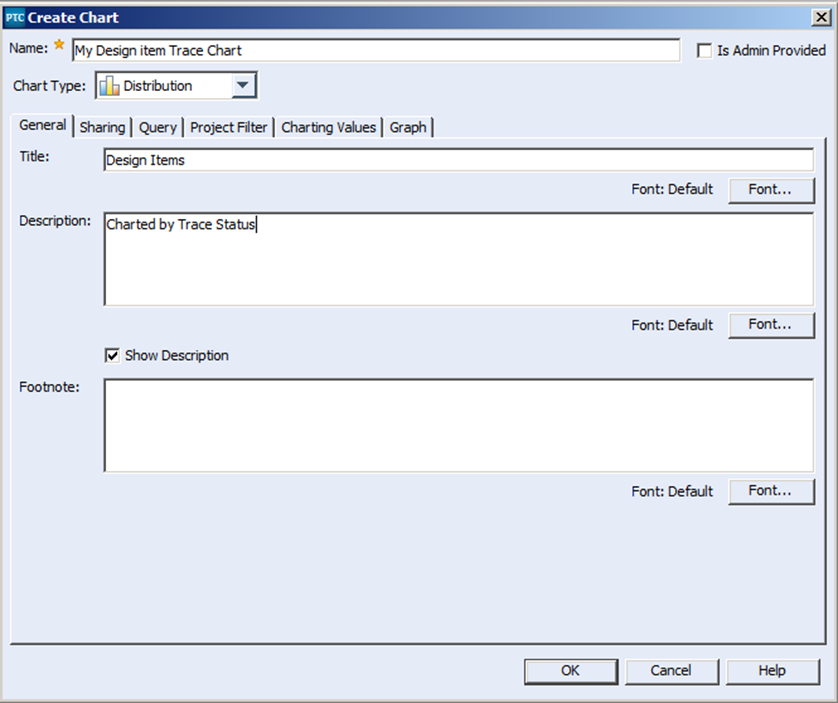
- Provide a name for your report, which is how it will be known across the system, a title and a description.
- Next we will go to the sharing tab, select the “Choose Principals…” and select to whom we would like to share the chart with. You can select specific individuals or groups to whom you could potentially share your chart with. Some Integrity systems may be configured to prevent end users from sharing your new chart globally through the “Everyone” group.
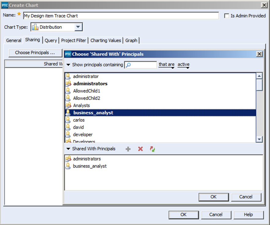
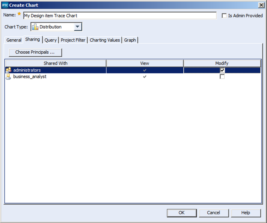
- The select users and groups in the Shared with list, at this point only able to View the chart in question. By selecting on the “Modify” checkbox, I have allowed anyone in the Administrator’s group to have modify privileges on the Chart.
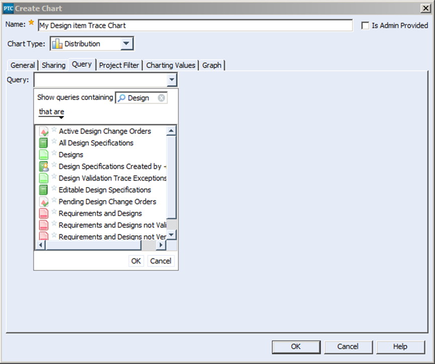
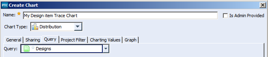
- Next select the Query tab. From the query dropdown list type “Design” into the “Show queries containing filter” to more easily find the “Designs” query. The Designs query is a system designed query provided with the Med Device Solution. This query will be used to retrieve the items we are going to chart.
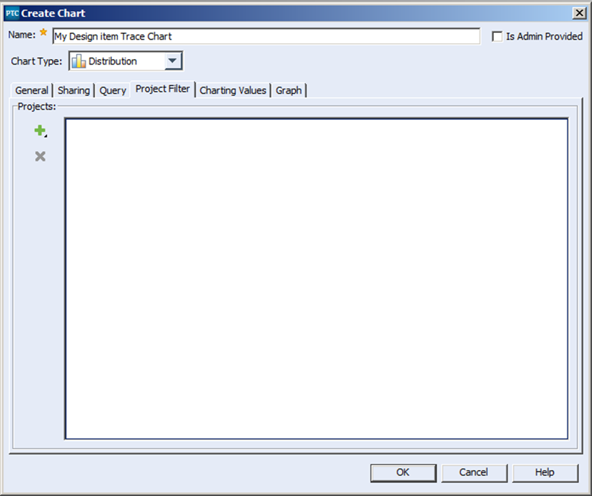
- The next tab is the Project Filter tab. By applying a project filter to your chart, you can restrict the items filter out the items displayed in your chart based on the selected project values. In this case we are simply going to leave this blank.
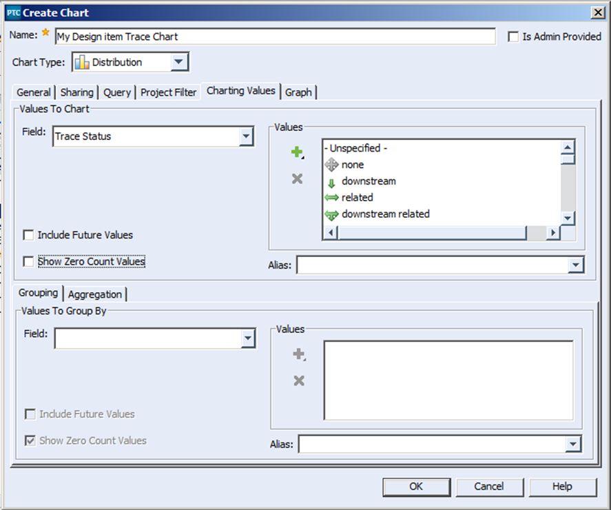
- The next tab is the Charting Values tab. In this tab we specify the field we wish to chart, as well as the values we wish to represent within the chart. In this case we will be charting the field “Trace Status” and we will be selecting every possible value that can be represented in that field.
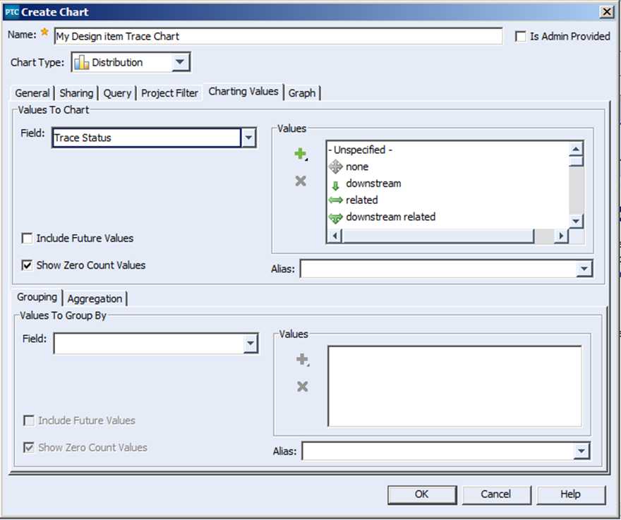
- The next thing we are going to do is to deselect the “Show Zero Count Values” check box. This means that the new chart we create will only chart the values where it has values to report, in this case helping us de-clutter the overall chart.
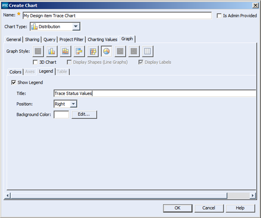
- The last tab is the Graph tab. In this tab we can select the type of chart we want to display, whether to display it in 3D or not. You can also define your own custom colors, as well as entitling the legend. In this case we are going to go with a two dimensional pie chart, with only the standard colors, and with the Legend entitled as follows:
- Finally select OK to create the chart.
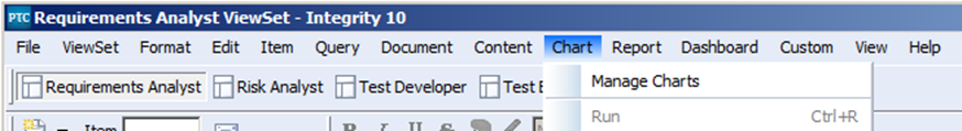
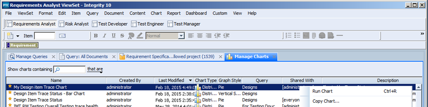
- Once the chart has been created you can run the chart from the Manage Charts window. You can open this window by selecting the menu Chart -> Manage Charts
- This will open up Manage Charts window in the Integrity Client, and from there it is a simple matter to run the desired chart:
- And the Final report, of course looks like this:
This chart is just one example of what you can do with charting in PTC Integrity. If you were to couple this report with similar reports across all of your PTC Integrity documents you can get a complete picture of what your system looks like. Not to mention that if you were to select any individual piece of the pie chart above you can drill down to the items that make up that slice. In my next blog article I am going to discuss how you can pull together Reports, Charts and even saved queries into more comprehensive dashboards that will present data in a fast and easy way for an overall interpretation of your product under development. Next Steps:
- Read the other articles in my “Metrics, Metrics, Metrics in PTC Integrity” series:
- Contact SPK and Associates to see how we can help your organization with our ALM, PLM, and Engineering Tools Support services.
- Read our White Papers & Case Studies for examples of how SPK leverages technology to advance engineering and business for our clients.