In the three previous rounds of this Metrics, Metrics, Metrics series, I discussed gathering metrics, and building Reports and Charts in PTC Integrity Lifecycle Manager. In this article, we will discuss how you can take various charts, reports and queries and put them together to build a PTC Integrity dashboard.
A dashboard is a static, defined view comprised of the following components; embedded charts, embedded reports, images, labels and links to queries, reports and other Web sites. They can be useful in viewing a given collection of components as a single unit, but are especially useful to provide a high-level overview of your project(s) in your PTC Integrity Lifecycle Manager solution.
In this blog article, I’m going to show you how you can take objects like the charts and reports we built in previous blog articles as well as queries and use them to build a dashboard in PTC Integrity Lifecycle Manager.
The dashboard we are going to build will look as follows:

Next I will take you through a step by step process of how to build this dashboard. Perform these steps to build this dashboard:
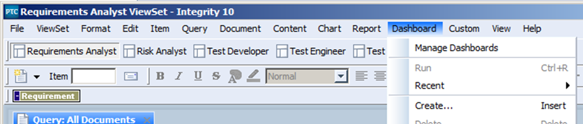
1) From the main menu bar on your Integrity Client select Dashboard -> Create
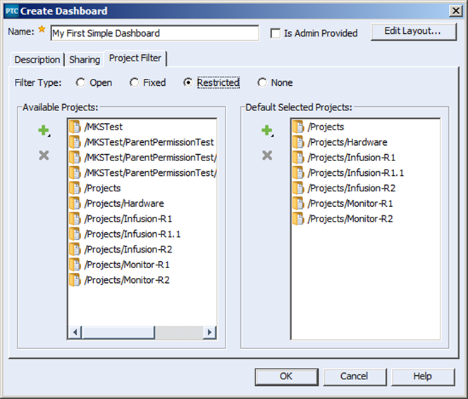
2) This will take you to the Create Dashboard dialog where we can enter in the various pieces of metadata to describe the Dashboard. We can use the Name and Description to provide information to the user about what the dashboard is and what it does.
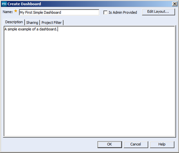
Note: The “Is Admin Provided” checkbox is only active when the user creating the dashboard is a member of the Administrator group in your PTC Integrity Lifecycle Manager system. The “Is Admin Provided” checkbox is useful if your intent is to create dashboards to be used across your entire system to support your development processes. Individuals creating dashboards for their own use and for the use of their specific team would not require the “Is Admin Provided” functionality.
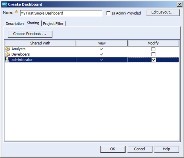
3) The Sharing tab is used to determine who has access to view the dashboard, as well as who has the ability to make changes to the dashboard. You can use the Choose Principals button, to select users and groups who can fulfil those roles. In this case I have made myself, the administrator, the only person who can make changes to the Dashboard, but anyone who is a member of the Analysts group or the Developers group has the ability to run the dashboard.
4) The Project filter tab allows you to set up filters based on selected projects to help narrow down the result set displayed in the objects that make up the dashboard. The Filter Type radio buttons allow you to apply whatever filters you choose in either a restrictive or non-restrictive fashion. The different types of filters are as follows:
- The Filter Type of Open means that whatever filters you choose apply are merely a default suggestion, users are allowed to include results from any project outside the current project.
- The Filter Type of Fixed means that the dashboard will only display results within the set of selected projects, and that’s it.
- The Restricted filter type will provide the user with a default selection of projects that the user can run the dashboard on, but using this filter type will also allow them to expand on that default filter selection to include more results, but only as far as the filter restriction allows.
- Finally, the Filter Type of None means that there is basically no filtering defined for the dashboard, all the results retrieved by the displayed Reports and Charts will be automatically run and displayed. This filter type is useful when the objects you’ve chosen to include in your dashboard are built with specific queries that retrieve a narrow result set.
NOTE: If you do not include filters, and choose to include objects in your dashboard with non-specific queries you run the risk of creating performance difficulties.
In this case I have chosen to build my dashboard using the Restricted filter type. By default when my dashboard runs the results will be restricted to only those specific projects located under the /Projects tree. If the user chooses to they can add results from any of the specified projects in the /MKSTest tree.
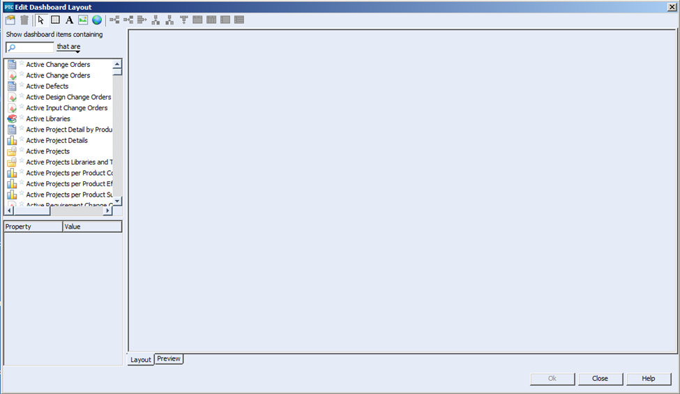
5) The next step is to actually lay out the objects you would like to see on your dashboard. To do this you use the “Edit Layout…” This will bring up the Edit Dashboard Layout dialog as shown below:
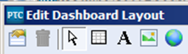
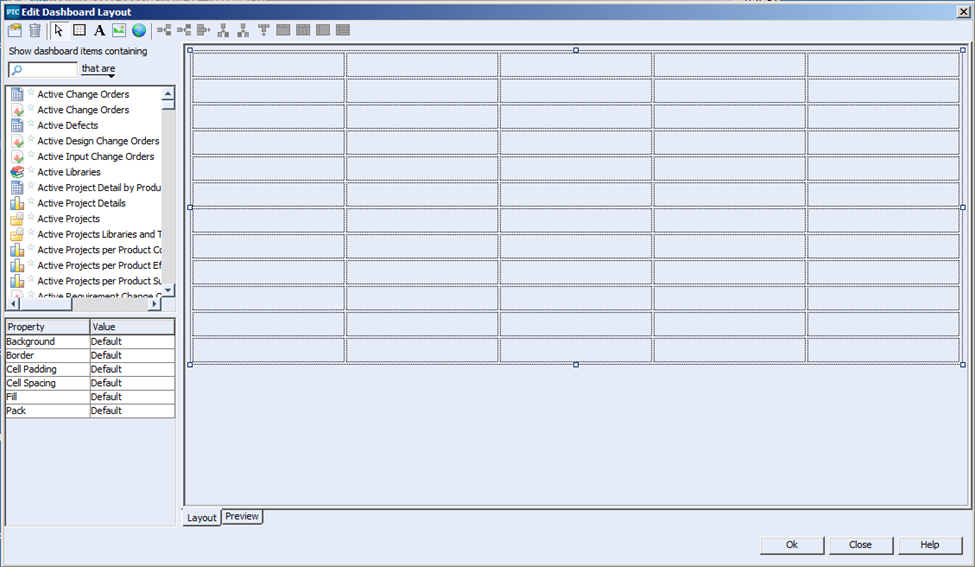
6) Before we can place any objects on the dashboard, we first need to define a grid to place them on. Select the Grid icon from the upper left hand corner of the Edit Dashboard Layout dialog:
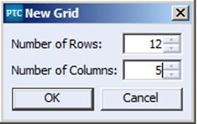
Then click within the layout pane of the Edit Dashboard Layout dialog. You will be presented with the New Grid dialog. From here you can define the initial dimensions of your grid in rows and columns. In this case I am going to create a grid with 5 columns and 12 rows. Don’t worry if you don’t get the columns and rows correct the first time, there are controls for adjusting your columns and rows.
7) The following grid is now inserted into the Layout pane:
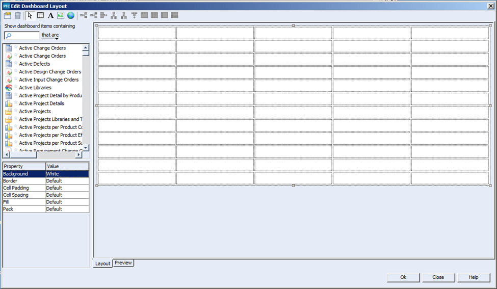
8) The first thing to notice is that grid as a whole is highlighted, and there is a set of properties on the lower left hand side of the Edit Dashboard Layout dialog associated with that selected grid. I’m going to change the Background of the grid to white.
9) Now we can start adding objects to the grid to create the look and feel of the dashboard. The first thing I am going to do is to add my dashboard a title and my corporate icon to the dashboard. To do this I use the Label and Image icons respectively
![]()
I click on the icon in question, and drag the label and image objects onto my grid;
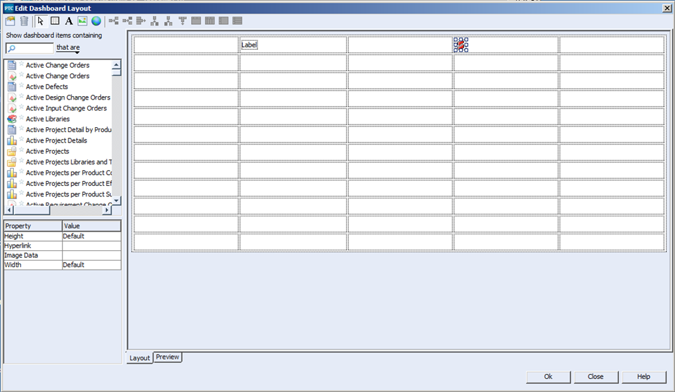
Next I select the items in question, and update the properties for each. For the Label field I enter “My First Dashboard” in the Text property, and for the Text style I pick “Title.”
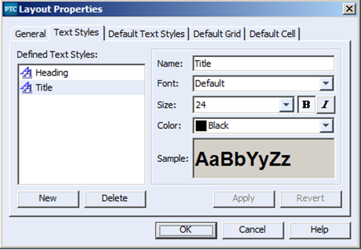
NOTE: You may have to create the Text Style “Title” yourself. Open the Layout Properties dialog and on the Text Styles tab, select the “New” button and define the new style as follows:
Note: On the cell containing the Title, you’ll have to set the Wrap property to false.
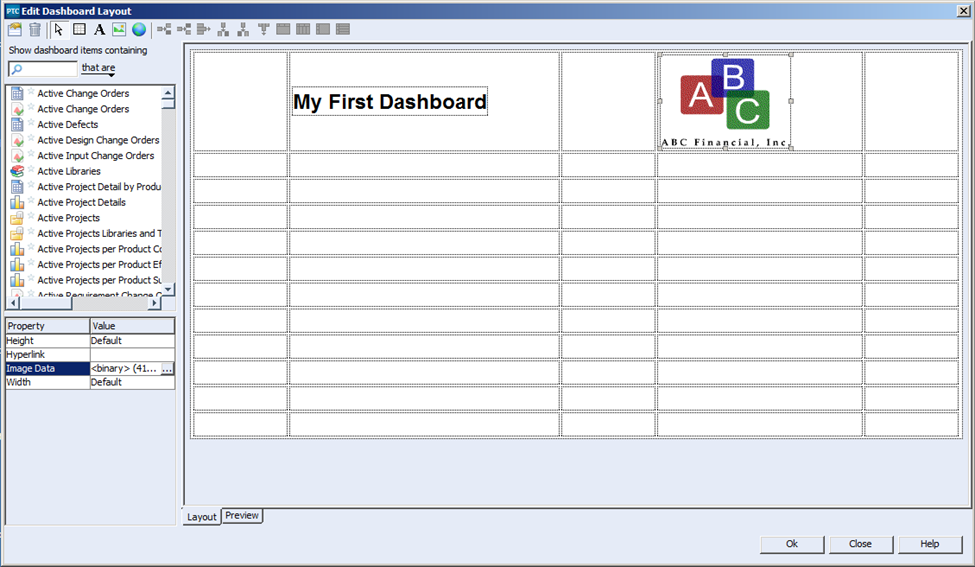
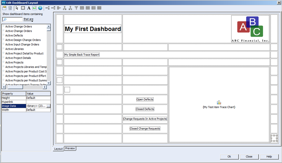
Once you’ve finished with the Label properties, you can move on to the image properties. Select the image icon you dragged into the grid to adjust the image properties. What I want to do here is to display my corporate icon. To do this I select the Image Data property field and click on the little browse icon, from there I can choose my icon from my local filesystem.
Once the Title and the logo have been added, my grid should look like this:
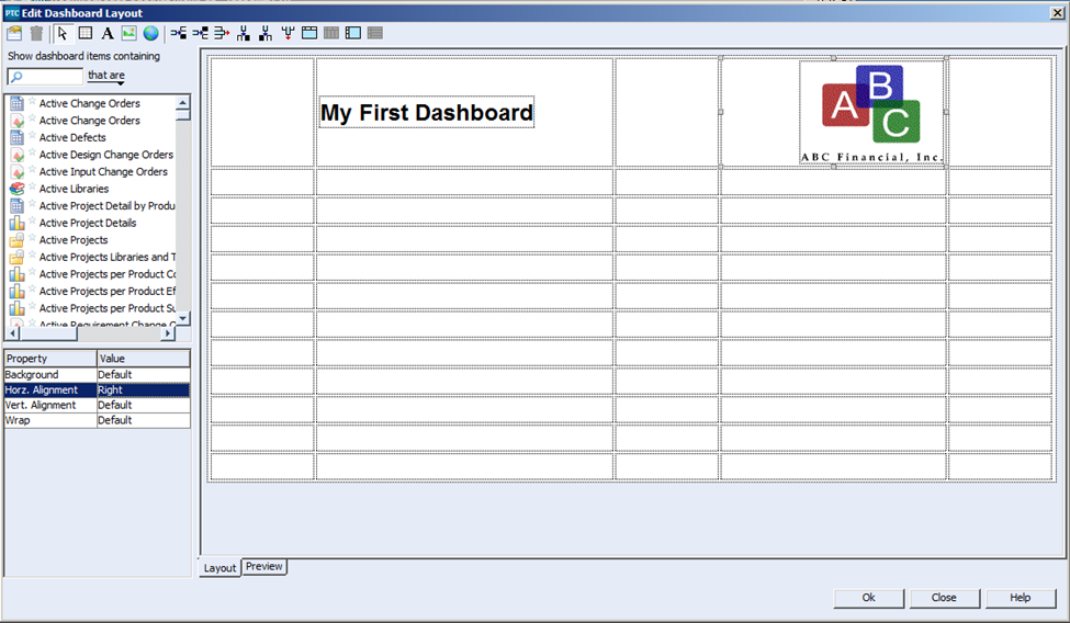
10) Next I will update the cell properties where my logo resides to ensure that it is right justified.
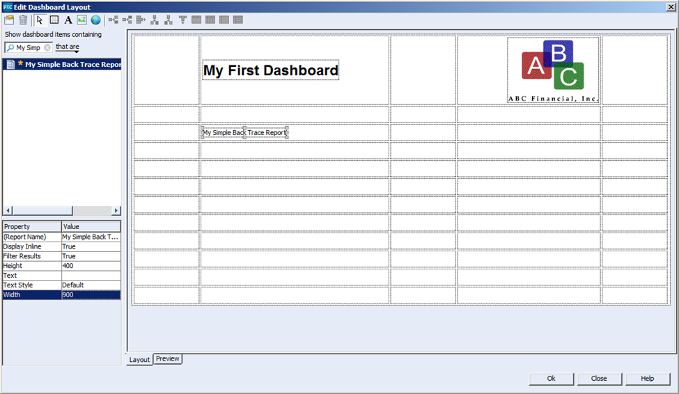
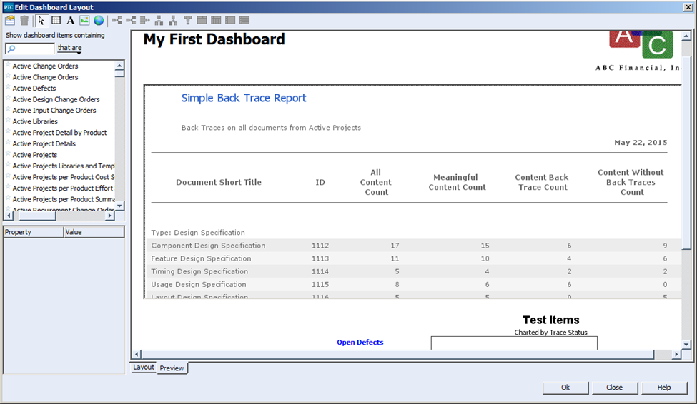
11) Next I will add the report “My Simple Back Trace Report”. To do this I will find the object in the Show dashboard items containing box. I can narrow down the size of the list by typing the title of the report I am looking for in the filter field provided. Once I have found the object I am looking for I can simply drag and drop it into the appropriate destination. Also note how I have updated the image properties:
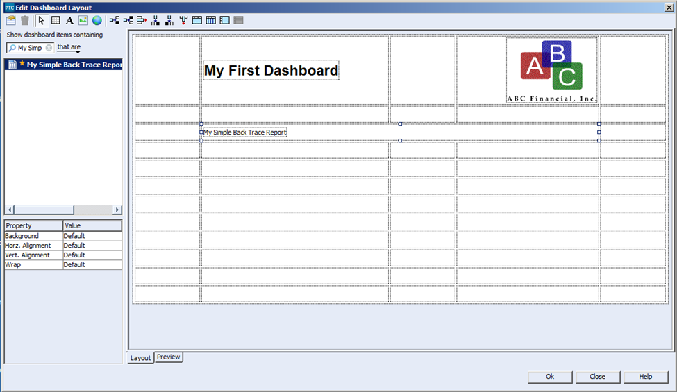
12) Since I want my report to span across the entire width of the report, minus the exterior columns of course, I need to merge the three interior columns into one column. To do this I start by selecting the cell where my report resides and then using the merge column icon I merge the cells together.
13) Next we will add the four queries to the grid. To do this we simply find the queries in the Show Dashboard items containing list and drag them onto the grid as follows:
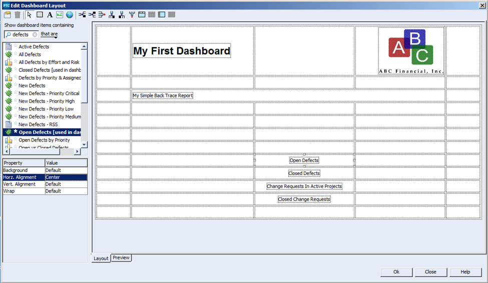
14) Next the chart called “My Test item Trace Chart” needs to be added to the grid. Unlike reports, charts will take up space immediately on the grid. Therefore, we will place the chart and use the merge row button so the chart appears to the right of the list of queries as one object as follows:
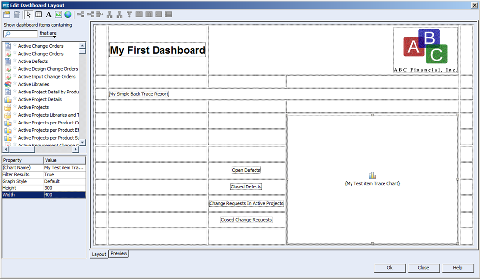
In order to make things fit better, I set the height and width to be 300 x 400 respectively.
15) If we were to preview the report as it stands right now, you’ll notice how the objects in the report do not appear to be spaced as nicely as they appear in the grid:
The problems in the dashboard are as follows:
- There is no right or left margin.
- There is no space between the title and logo line and the report.
- There is no space between the bottom of the report and the queries and Test Chart.
- The list of queries does not appear to be centered on the left margin of the chart.
To resolve these issues, we need to introduce invisible spacers into the Dashboard. These spacers can be accomplished by Label boxes where the text matches the background, or you can use some pre-defined spacer images that can be found on your PTC Integrity server. You can ask your administrator to send you a copy of these. For my purposes I am going to use a 20×20.png image file as a spacer, and I placed five of them on the grid as follows:
Note: In this case I set the height and width of the report to be 350 x 900 respectively. I did this to make the objects fit better on the grid.
16) Lastly, in order to make queries look more like hyperlinks, I created a simple blue text style to change the text colours of the query names.

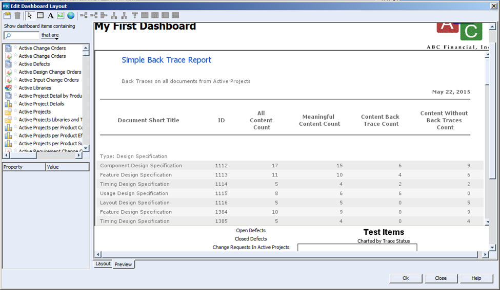
17) When we look at the report in the preview pane we now see this:
18) Once you’ve saved the Layout and saved new Dashboard, you can execute it from the Manage Dashboards list. The dashboard should look as follows:
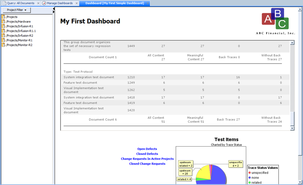
Note: You may need to select the grid as a whole and set the Pack property to “True” in order to achieve the actual presentation shown here.
This article was longer then I originally intended it to be, but in order to do the topic justice there wasn’t any way of making shorter without losing some important details along the way. I think I have provided you with a good example that you can leverage as you go forth and build your own dashboards. Future articles I post about Metrics in PTC Integrity will help you add a little bit glamour to your charts, reports and dashboards to help impress your friends, your loved ones and most importantly your customers.
Next Steps:
- Read the other articles in my “Metrics, Metrics, Metrics in PTC Integrity” series:
- Contact SPK and Associates to see how we can help your organization with our ALM, PLM, and Engineering Tools Support services.
- Read our White Papers & Case Studies for examples of how SPK leverages technology to advance engineering and business for our clients.